The Minimum Viable Product, aka MVP, the holy grail of startups that guarantees the greatest revenue opportunity for the least cost. By definition, an MVP should be an automatic success. So, why do so many MVP’s still fail? Defining the minimum is easy. It’s the ‘viable’ part that everyone screws up.
A true MVP must balance the viability of several different perspectives, technology, business & marketing, and the user. The problem is that viability means different things to different folks and most MVP’s are skewed to one perspective or the other. What ends up being ‘viable’ is usually what is easiest to develop. That may be viable for the developers, but it won’t be for the users.
In the UX community, we have a saying:
If it’s easy to code, it’s hard to use.
If it’s easy to use, it’s hard to code.
A true MVP is viable from all three main perspectives, but there seems to be no defined process to achieve that, until now.
The Viability Matrix
I’ve developed a successful Viability Matrix that objectively balances the priorities of the three main perspectives. This matrix accurately identifies valuable MVPs, every time. Moreover, the matrix has also proven that the previously assumed MVP’s were not MVP’s, at all, but designs that solved the wrong problems, very well.
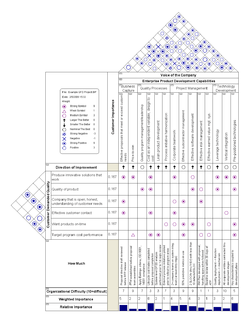
This new Viability Matrix is similar to the Quality Function Deployment (QFD) House of Quality matrix (https://en.wikipedia.org/wiki/Quality_function_deployment), but with some notable differences.
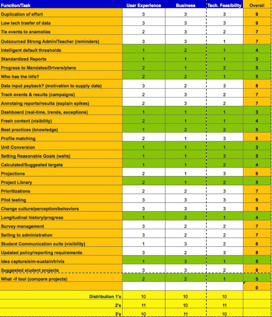
Rather than prioritizing technical functions like the House of Quality, the Viability Matrix is based on user tasks. Before attempting to apply the matrix, you must perform user research and a task analysis. (see my blog post about this: https://searchenginewatch.com/sew/how-to/2336547/task-analysis-the-key-ux-design-step-everyone-skips)
The matrix is actually quite simple to fill out, but difficult to complete. This difficulty is actually one of its key strengths. Scoring the various tasks highlights the differences between the three perspectives, which ultimately defines the best MVP. Discussing these differences fosters a very collaborative understanding between the 3 perspectives and produces a much more balanced MVP.
The Process
The process involves listing the various user tasks identified during the user research. I must stress the importance of listing the tasks rather than just the functions or features since users must complete entire tasks, not just use specific features, in order to achieve their desired outcome. I’ve seen too many cases where a website or product provided features that did not fully support a task and users struggled to achieve the right result.
Begin by listing all of the tasks down the left side of the matrix. Don’t worry about separating them by persona the first few times performing the matrix. The process is hard enough without adding in the complexities of user persona differences.
It’s paramount that each of the three perspectives be adequately represented during the ranking process; otherwise the results become very skewed and therefore misleading. You need to rank each task from each perspective on a 1-3 scale.
VERY IMPORTANT: You MUST have equal distribution of the rankings within each column (perspective) otherwise the matrix will be inaccurately skewed.
The result is a list of prioritized tasks that accurately represents the viability of the MVP. Be warned, though. The MVP you get from the matrix won’t be the MVP you expect. However, it will be obvious that your new MVP will transform, even disrupt, your market.
-------------
There’s more to the ranking process than I can describe in a blog post. If you want to learn how to conduct this validity matrix properly, contact me and I’ll help. Larry Marine: LMarine@IntuitiveDesign.com


